Character Comb Control 
Description
The Character Comb control displays text so that each character is printed in an individual cell.
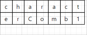
An example of a Character Comb control
Properties Common to Most Controls
For more information about the properties listed below, see Properties Common to Most Controls.
- Actions: Align to Grid, Size to Grid, Center Horizontally, Center Vertically, Bring to Front, Send to Back, Fit Bounds to Container
- Styles: Even Style, Odd Style, Style
- Appearance: Background Color, Border Color, Border Dash Style, Border Width, Borders, Font Name, Font Size, Font Unit, Font Effects, Foreground Color, Padding
- Behavior: Can Publish, Keep Together, Visible
- Data: Tag
- Design: Name
- Layout: Location, Size
- Navigation: Bookmark, Parent Bookmark, Navigation URL
For more information regarding each of the property groups, see the Control Reference.
Actions
|
Actions |
|
Fit Bounds to Text |
|
Text |
|
Type: String Can be configured in the Properties or Expressions panel. Sets the text to appear in the The value of the
|
|
Text Format String |
|
The Text Format String Editor provides the ability to apply formatting to data. You can select one of the pre-built formats or create your own. The Text Format String Editor cannot format values that have been manually entered into a control. For more information, see the help regarding the Format String Editor and Format Specifiers. |
|
Summary: Running |
|
Sets the The summary function must be configured in the The report areas available from the drop-down list include:
|
|
Summary: Ignore Null Values |
|
Type: Boolean Sets whether null values should be ignored when a summary is calculated. If null values are included in the calculation, they are treated as zeros. |
|
Summary: Treat Strings As Numerics |
|
Type: Boolean Determines whether a summary function should treat strings as numeric values. |
|
Auto Width |
|
Type: Boolean Specifies whether or not the width of a control depends on the text within it. Enable this property to print the text of a control in full without it being cut off by the dimensions of the control. This may be required when the contents of a control are populated using a data source and the full length of the value is unknown until runtime. Contents will be cut off if they reach the bounds of the page. This setting has no effect on the width or position of other controls. This means that if the control expands to fit its contents, it may overlap with nearby controls. If Word Wrap is enabled, the control's width can only be decreased. If Word Wrap is disabled, the control's width can be increased or decreased to best fit a label's contents. |
|
Can Grow |
|
Type: Boolean Sets whether the control's height can grow to display the contents at runtime. Enabled by default. If there are other controls below the selected control, they will be moved down to prevent overlapping. If the Label control is used to calculate a summary, the |
|
Can Shrink |
|
Type: Boolean Sets whether the control's height can decrease if the contents do not completely fill the control at runtime. If there are other controls below the current control, they will be moved up to remove the unused space. If the Label control is used to calculate a summary, the |
|
Multiline |
|
Type: Boolean Sets whether the control respects carriage returns entered into the Enabled by default. |
|
Word Wrap |
|
Type: Boolean Determines how text is rendered when it does not completely fit into the bounds of the control. When enabled, text will start a new line once it meets the right side of the control. Otherwise, the text is displayed on a single line. Enabled by default. |
 Resize the bounds of a control to fit static text exactly.
Appearance
|
Text Alignment |
|
Can be configured in the Properties or Expressions panel. Specifies the alignment of the |
Behavior
|
Auto Width |
|
Type: Boolean Specifies whether or not the width of a control depends on the text within it. Enable this property to print the text of a control in full without it being cut off by the dimensions of the control. This may be required when the contents of a control are populated using a data source and the full length of the value is unknown until runtime. Contents will be cut off if they reach the bounds of the page. This setting has no effect on the width or position of other controls. This means that if the control expands to fit its contents, it may overlap with nearby controls. If Word Wrap is enabled, the control's width can only be decreased. If Word Wrap is disabled, the control's width can be increased or decreased to best fit a label's contents. If this property is enabled along with |
|
Can Grow |
|
Type: Boolean Sets whether the control's height can grow to display the contents at runtime. Enabled by default. If there are other controls below the selected control, they will be moved down to prevent overlapping. |
|
Can Shrink |
|
Type: Boolean Sets whether the control's height can decrease if the contents do not completely fill the control at runtime. If there are other controls below the current control, they will be moved up to remove the unused space. |
|
Multiline |
|
Type: Boolean Sets whether the control respects carriage returns entered into the Enabled by default. |
|
Process Duplicates Mode |
|
Sets how Methods for processing duplicate data include:
This setting has no effect on intersecting controls or in vertical bands. If there are no controls in a band after duplicates are removed, VertiGIS Studio Reporting does not print the band. |
|
Process Duplicates Target |
|
Sets what data is processed by the Options include:
For the Character Comb control, the |
|
Process Null Values |
|
Specifies how a Methods of processing the null values include:
This setting has no effect on intersecting controls or in vertical bands. If there are no controls in a band after duplicates are removed, VertiGIS Studio Reporting does not print the band. |
|
Text Fit Mode |
|
This property is not available if Specifies how the text of a control can be resized to fit the boundaries of the control. The options for modifying the control's text size include the following:
|
|
Word Wrap |
|
Type: Boolean Determines how text is rendered when it does not completely fit into the bounds of the control. When enabled, text will start a new line once it meets the right side of the control. Otherwise, the text is displayed on a single line. Enabled by default. |
Data
|
Null Value Text |
|
Type: String Specifies the text shown in the control when the value of its bound data field is null. |
|
Summary: Running |
|
Sets the The summary function must be configured in the The report areas available from the drop-down list include:
|
|
Summary: Ignore Null Values |
|
Type: Boolean Sets whether null values should be ignored when a summary is calculated. If null values are included in the calculation, they are treated as zeros. |
|
Summary: Treat Strings As Numerics |
|
Type: Boolean Determines whether a summary function should treat strings as numeric values. |
|
Text |
|
Type: String Can be configured in the Properties or Expressions panel. Sets the text to appear in the The value of the
|
|
Text Format String |
|
The Text Format String Editor provides the ability to apply formatting to data. You can select one of the pre-built formats or create your own. The Text Format String Editor cannot format values that have been manually entered into a control. For more information, see the help regarding the Format String Editor and Format Specifiers. |
Layout
|
Cell Height |
|
Type: Single Specifies the height of cells in the control. This setting is ignored when the |
|
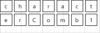
Cell Horizontal Spacing |
|
Type: Single Specifies the horizontal spacing between adjacent cells in the control. This value does not depend on the specified border width of a control.
An example where Cell Horizontal Spacing is set to 5 and Cell Vertical Spacing is set to 5 |
|
Cell Size Mode |
|
Specifies whether or not the cell size should depend on the current font size. Options for this property include:
|
|
Cell Vertical Spacing |
|
Type: Single Specifies the vertical spacing between adjacent cells in the control. This value does not depend on the specified border width of a control.
An example where Cell Horizontal Spacing is set to 5 and Cell Vertical Spacing is set to 5 |
|
Cell Width |
|
Type: Single Specifies the width of cells in the control. This setting is ignored when the |
Printing
|
Right to Left |
|
Specifies the layout of the content within a The options include:
|
Related Tutorials
Refer to the following resources for additional help on implementing this control: