Band Reference
The Band Reference documents each band available in VertiGIS Studio Reporting. A band's documentation may include the following sections:
-
Description: A description of what the band does.
-
Properties Common to Most Bands: See Properties Common to Most Bands below.
-
Actions: Group of commonly used properties and actions for the band. These properties are aggregated at the top of the Properties panel, but also appear in their respective property groups. Changes made to the properties that appear in this panel will be reflected in the property group they belong to.
-
Styles: Group of properties that define the styles applied to the band. For more information see Styles.
-
Appearance: Group of properties for configuring the appearance of the contents of a band, such as background color or text formatting. See Inherit Settings from the Band or Report for more information on how bands and controls can share Appearance property settings.
-
Behavior: These properties enable a band and its contents to resize or reformat at run time.
-
Data: Group of properties that allow you to shape
-
Layout: Group of properties that determine the size of the band in the
-
Printing: Supports right-to-left writing systems.
-
Properties Common to Most Bands
Style
|
Style |
|
Type: String Can be configured in the Properties or Expressions panel. Sets the style used. |
Appearance
|
Background Color |
|
Type: Color Can be configured in the Properties or Expressions panel. Specifies the |
|
Border Color |
|
Type: Color Can be configured in the Properties or Expressions panel. Specifies the |
|
Border Dash Style |
|
Can be configured in the Properties or Expressions panel. Specifies the dash style for the |
|
Border Width |
|
Type: Single Can be configured in the Properties or Expressions panel. Specifies the width of the border(s) in pixels, using a floating point value. |
|
Borders |
|
Can be configured in the Properties or Expressions panel. Applies a set of borders (top, right, bottom, left) to a control. |
|
Font |
|
Type: Font Can be configured in the Properties or Expressions panel. Sets the
|
|
Foreground Color |
|
Type: Color Can be configured in the Properties or Expressions panel. Specifies the |
|
Padding |
|
Can be configured in the Properties or Expressions panel. Defines the location of a |
|
Text Alignment |
|
Can be configured in the Properties or Expressions panel. Specifies the alignment of the |
Behavior
|
Keep Together |
|
Type: Boolean Sets whether an item can be split horizontally across pages. When |
|
Page Break |
|
Specifies where to make a page break. Options include:
|
|
Visible |
|
Type: Boolean Can be configured in the Properties or Expressions panel. Sets whether the band is visible at run-time. |
Data
|
Tag |
|
Type: Object Can be configured in the Properties or Expressions panel. Stores data that is closely associated with the control. |
Design
|
Name |
|
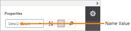
Type: String Name assigned to the band. The name can contain letters, numbers, and the underscore character. It cannot contain spaces or special characters. The value of the Name property can be used to identify the band in the report items list at the top of the Properties and Expressions panels.
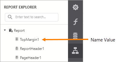
Name property value in the report items list A band's Name property is also used to identify the band in the Report Explorer panel.
Name property value in the Report Explorer |
Layout
|
Size |
|
Can be configured in the Properties or Expressions panel. Specifies the height and width of the |