Calculate Summaries in Charts
Chart Designer has predefined summary functions that you can use to calculate the values of the data points. The functions are SUM, MIN, MAX, AVERAGE, and COUNT.
You can only use summary functions with views in which the data points have a single value. You cannot use summary functions when the data points have two or more values, such as in Gantt and Bubble views.
A data point for SUM, MIN, MAX, or AVERAGE can be represented as follows:
data point = (argument1, Function(argument2))
where:
argument1is specified in the Argument Data Member settingFunctionis SUM, MIN, MAX, or AVERAGEargument2, the field that the function operates on, is specified in Summary Function | Argument
A data point for the COUNT function is:
data point = (argument1, COUNT)
The COUNT function operates on the Argument Data Member field.
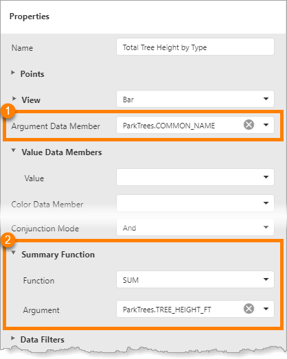
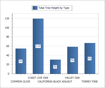
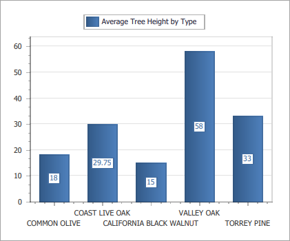
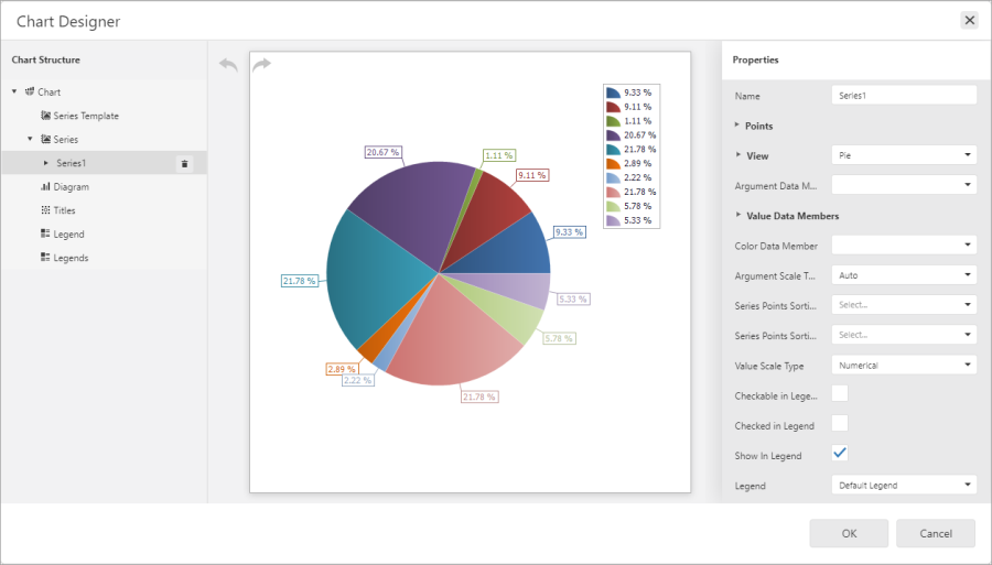
The screen capture below shows an example of the configuration for a series that plots the total height of each type of tree in the data set (left). The generated chart is shown at the right.
|
Settings to configure arguments ( |
|
Chart generated by the configuration at the left |
|
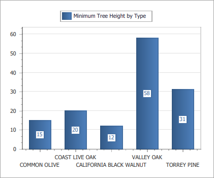
To plot the shortest tree of each type, set Function to MIN.
|
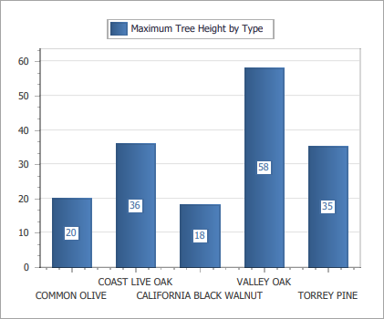
To plot the tallest tree of each type, set Function to MAX.
|
|
|
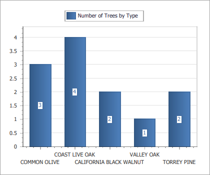
To plot the number of trees of each type, set Function to COUNT.
|
Tutorial - Create a Pie Chart that Uses the COUNT Function
This tutorial shows how to create a pie chart.
The tutorial uses a public ArcGIS feature service called Phone Incidents that maps security incidents reported by phone. The incident field is a coded value domain field. Each code represents a type of incident—Battery, Petty Theft, and so on. The chart uses the COUNT function to count the number of incidents of each type.
In a pie series, each data point is a slice of the pie. Different colors are used to represent the different arguments (incident types). The size of a slice is determined by the data point's value (the number of incidents of that type).
The data used in the tutorial is given in the table below.
Because anyone can edit the feature service used in this tutorial, the data may have changed since the tutorial was written.
|
Domain Code |
Domain Description |
Number of Incidents |
Percentage |
|---|---|---|---|
|
0 |
Battery |
2 |
11.76 |
|
1 |
Petty theft |
3 |
17.65 |
|
2 |
Disturbing the Peace |
2 |
11.76 |
|
3 |
Cardiac Emergency |
2 |
11.76 |
|
4 |
Respiratory Emergency |
2 |
11.76 |
|
5 |
Vehicle Accident |
6 |
35.29 |
|
Total |
17 |
99.98 * |
|
* The missing 0.02% is rounding error.
The tutorial is divided into the following steps:
Step 1: Create the report
-
Add an ArcGIS data source with the following URL:
https://sampleserver6.arcgisonline.com/arcgis/rest/services/PhoneIncidents/FeatureServer/
To add the data source, click Data Sources in the sidebar, select ArcGIS, enter a name, paste the service's URL into the Service URL box, and click Save.
-
Create a new, blank report.
Click File, click New, and double-click Blank Report.
-
Bind the report to the data source's Dispatch table.
Click Add SQL Data Source
 , select the data source, and click Next. Expand Tables, select Dispatch, and click Finish.
 -
Add a Report Header band.
Select the report and click the Insert Report Header Band icon
 in the Actions section.
Step 2: Add the Chart control
-
Drag a Chart control
 to the Report Header band and adjust the control's size and position.
Placing the chart in the Report Header band makes the chart appear once at the beginning of the report.
Chart control added to the Report Header band
Step 3: Open Chart Designer
-
Make sure the Chart control is selected and click Run Designer to open Chart Designer.
Step 4: Add a Pie series to the chart
-
In Chart Structure, click Series to show the Add icon
 .
. -
Click the Add icon and select Pie
 from the drop-down list.
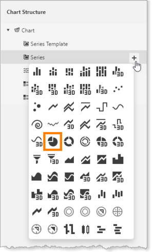
Pie series
A pie series is added to the chart.
Pie series added to the chart
Step 5: Specify the source of the X and Y coordinates
-
Make sure the new series is selected in Chart Structure.
-
In the Properties panel, select incident from the Argument Data Member drop-down list.
The Argument Data Member setting specifies the field that the X coordinates will come from (the arguments).
-
Scroll down and expand Summary Function.
-
Set Function to COUNT.
The COUNT function counts the number of records for each type of incident. By default, pie charts express the counted records as percentages of the whole.
When you click away from the Function setting, the chart preview will re-draw. Due to the nature of the sample data used by the chart preview, you will not see a significant change in the preview.
Step 6: Preview the report
-
Click OK to close Chart Designer.
-
Click Preview
 to preview the report.
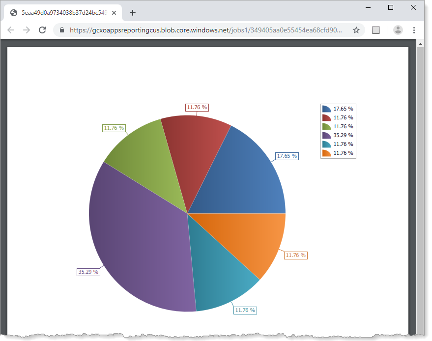
Report preview showing a pie chart that plots the number of security incidents of different types as percentages
You have successfully created a pie chart.
Enhance the Chart
This section shows a few ways to improve the chart's appearance and utility.
This section has the following steps:
Step 1: Add a title to the legend
-
Re-open Chart Designer.
-
In Chart Structure, select Titles to show the Add icon
. -
Click the Add icon to show the drop-down list of title positions relative to the chart.
-
Select top right
 .
. A title is added to the chart. The new title appears in Chart Structure, the preview, and the Properties panel.
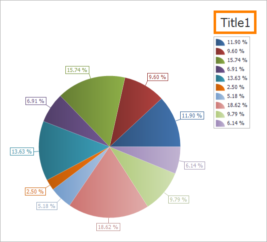
Chart preview showing the legend's default title at the center right
You can change the title's position using the Dock and Alignment settings.
-
Make sure the title is selected in Chart Structure.
-
In the Properties panel, type Key in the Text box.
-
Click away from the Text box to update the chart preview.
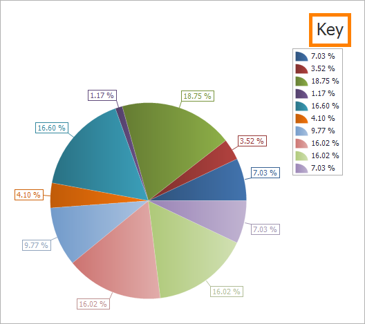
Chart preview, showing the updated title for the legend
Step 2: Show values instead of percentages
In this step, you will change the labels on the pie slices and in the legend from percentages to values. Because the summary function is COUNT, the value of a data point is the number of records for that argument.
-
In Chart Structure, select the chart's series.
-
Scroll down the Properties panel and expand Label.
-
Type {V} in Text Pattern.
The {V} text pattern shows the value of data points.
Changing the text pattern for the series also changes the pattern for the legend. Later, you will customize the legend's labels.
You can use literals in the text pattern. For example, in the pattern {V} incidents, the word "incidents" is a literal that will appear in the report output. For example, if the value is 2, the label will be "2 incidents".
-
Click away from the Text Pattern box to update the chart preview.
The chart preview's sample data may not appear realistic. For example, in the generated report, the number of incidents will always be a whole number.
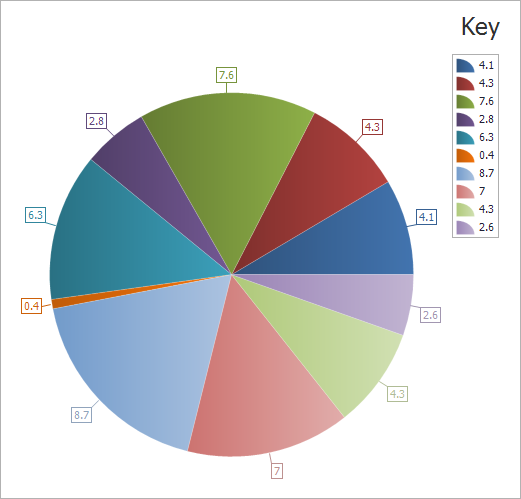
Chart preview, showing values instead of percentages in the labels
-
Click OK to close Chart Designer.
-
Click Preview
to preview the report.Previewing the report shows the actual data.
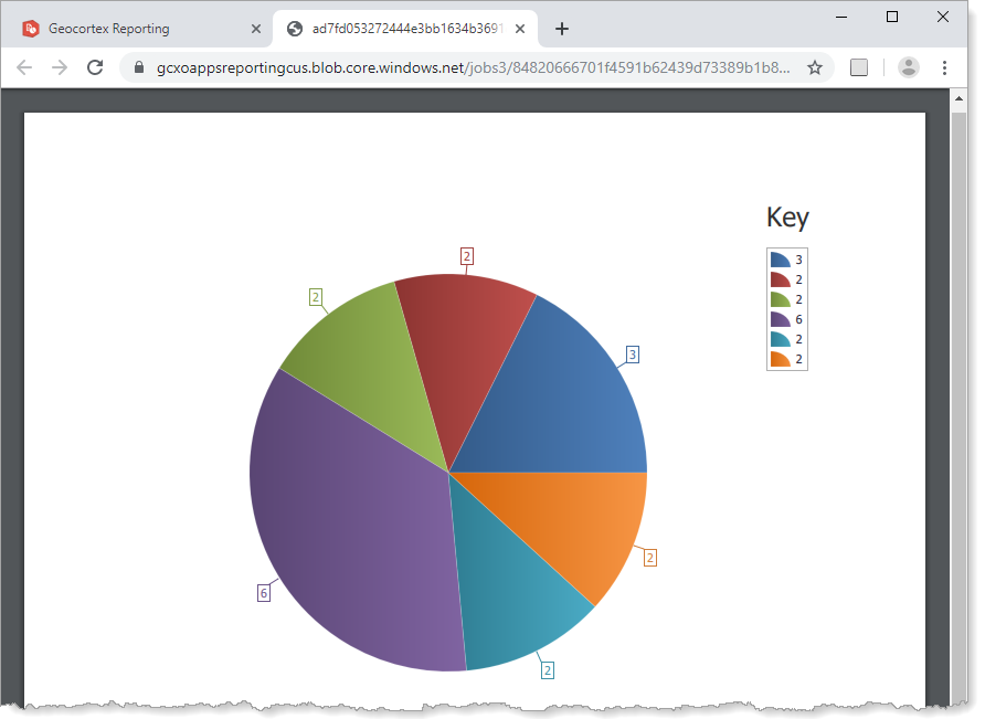
Report preview, showing values instead of percentages in the series and legend labels
Step 3: Show domain codes in the legend
When a series' Argument Data Member setting is a coded value domain field, the arguments are codes. In this tutorial, the arguments are integers from 0 to 5, each of which represents a type of security incident—Battery, Petty Theft, and so on.
The {A} text pattern allows you to show arguments in a chart's labels. In this step, you will use the {A} pattern to show the codes in the legend's labels, while leaving the series' labels to show values. To do this, you configure the series' Legend Text Pattern setting, which affects the legend's labels only, not the series labels.
-
Re-open Chart Designer.
-
In Chart Structure, select the series.
-
Set Legend Text Pattern to {A}.
The {A} text pattern shows the data points' arguments.
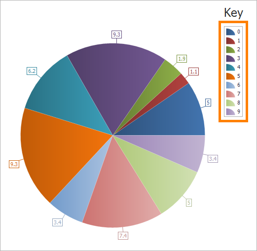
Chart preview, showing domain codes in the legend
-
Close Chart Designer and click Preview
to preview the report.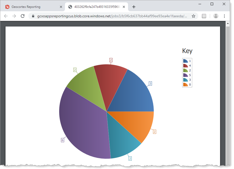
Report preview showing domain codes in the legend
Step 4: Show domain descriptions in the legend
In the chart, the incident types are represented by different colors. To interpret the chart, the user needs to know what the colors represent. To provide this information, you will change the legend's labels to show the domain descriptions.
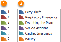
Legend with codes ( ) and with descriptions (
 )
)
To show domain descriptions, you will add a calculated field to the table. A calculated field is a field whose value is calculated by an expression that you define in the configuration. In this case, you will configure the calculated field to use the GetDomainDescription() function, which will set the calculated field to the domain description. Then, instead of using the original coded value domain field (incident) as the Argument Data Member, you will use the calculated field.
The series' Legend Text Pattern setting must be set to {A}, as shown in Step 3: Show domain codes in the legend.
-
In Report Designer, open the Field List
 .
. -
Expand the data source.
-
Click the Dispatch table to show the management buttons.
-
Click Add Calculated Field
 .
. 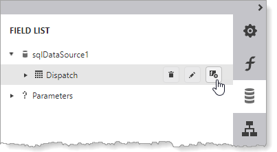
Add a calculated field to the Dispatch table
A calculated field is added.
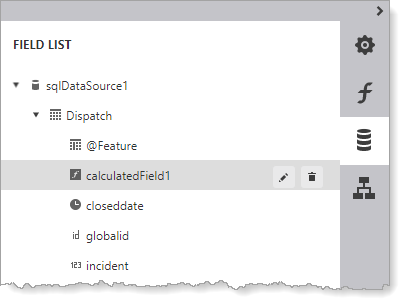
Calculated field added to the Dispatch table
-
Click Edit
 to edit the calculated field.
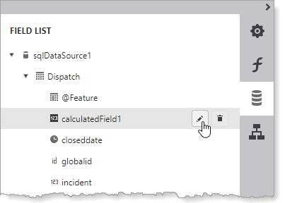
Edit the calculated field
The calculated field expands to show its settings.
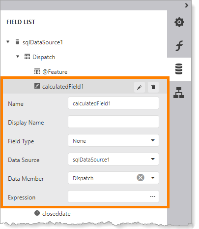
Calculated field and its settings
-
Configure an expression that gets the domain descriptions:
-
Click the
 icon in the Expression box to open the Expression Editor.
 -
Expand Functions | GIS in the bottom left pane (
). -
Double-click GetDomainDescription([@Feature, '') (
) to add the function to the expression ( ).
).In order to get domain descriptions, the query must return @Feature. See Modify a Query to Return Different Fields for instructions on viewing and changing the fields that the query returns.
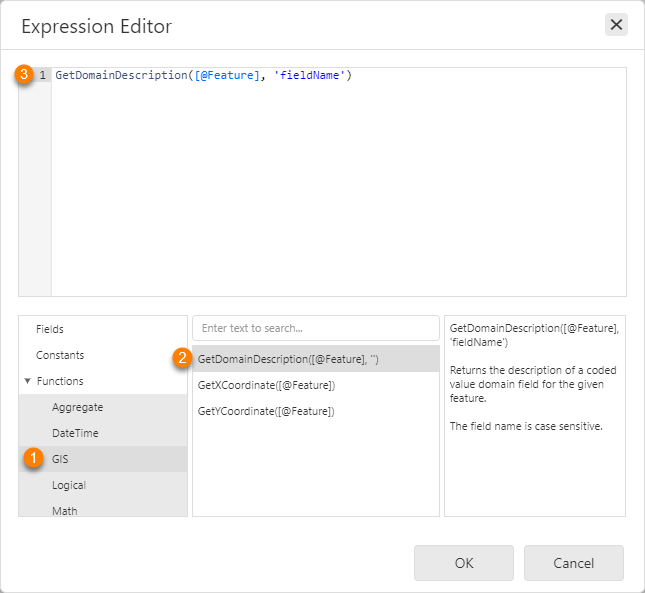
Add the function that will get the domain description
-
In the expression, change fieldname to incident.
The final expression should look like this:
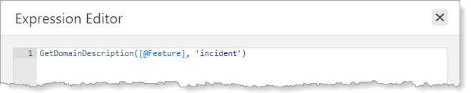
Expression to get domain descriptions from the
incidentfield - Click OK to close the Expression Editor.
-
-
Verify your configuration for the calculated field by comparing it to the screen capture:
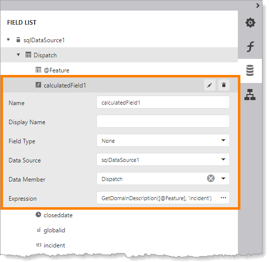
Final configuration for the calculated field
-
Open Chart Designer.
-
In Chart Structure, select the series.
-
In the Properties panel, select the calculated field from the Argument Data Member drop-down list.
This replaces the incident field.

Use the calculated field as the series' Argument Data Member
-
Click OK to close Chart Designer.
-
Click Preview
to preview the report.
Report preview showing coded value domain descriptions in the legend