Get Started with Charts
This topic lays the foundation needed to create real-world charts for your reports. It has the following sections:
-
Tutorial - Create Your First Chart: Provides instructions to create a bar chart with coordinates from fields in a feature service.
-
Enhance Your First Chart: Shows how to add titles, move the legend, change the type of chart, and add a second series to the chart.
-
Troubleshooting: Provides suggestions for fixing the configuration if the chart is blank when you preview the report.
Tutorial - Create Your First Chart
This tutorial shows how to create a simple bar chart. The tutorial uses a public ArcGIS feature service called NapiervilleShelters that maps emergency shelters. The chart plots the capacity of emergency shelters. At the end of the tutorial, you will have a working chart.
In this tutorial, the coordinates of the data points come from fields in the feature service. The X coordinates (arguments) come from the facname field and the Y coordinates (values) come from the sheltcap field. You specify these fields in the Argument Data Member and Value Data Member | Value settings respectively.
The data points can be represented as follows:
point1 = (facname1, sheltcap1)point2 = (facname2, sheltcap2)point3 = (facname3, sheltcap3)...
Because anyone can edit the feature service used in this tutorial, the data may have changed since the tutorial was written.
There are two ways to preview a chart: using the preview in Chart Designer, or by previewing the report in Report Designer. Previewing the chart uses sample data provided by Chart Designer. Previewing the report uses the actual data. For some changes you make, previewing the chart in Chart Designer is sufficient to verify your configuration. In other cases, you may want to preview the report.
The tutorial is divided into the following steps:
Step 1: Create the report
-
Add an ArcGIS data source with the following URL:
http://sampleserver5.arcgisonline.com/arcgis/rest/services/NapervilleShelters/FeatureServer/
To add the data source, click Data Sources in the sidebar, select ArcGIS, enter a name, paste the service's URL into the Service URL box, and click Save.
-
Create a new, blank report: Click File, click New, and double-click Blank Report.
-
Bind the report to the data source: Click Add SQL Data Source
 , select the data source, and click Next. Expand Tables, select Shelters, and click Finish.
 -
Change the page orientation to Landscape: Make sure the report is selected and select the Page Settings | Landscape checkbox.
This is to simplify the formatting that is required for the tutorial.
-
Add a Report Header band: Select the report and click the Insert Report Header Band icon
 in the Actions section.
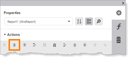
Location of icon to add a Report Header band to the report
Step 2: Add the Chart control
-
Drag a Chart control
 to the Report Header band. Position the control at the top left of the band. To simplify the formatting that is required, resize the control to 9" x 5".
Placing the chart in the Report Header band displays the chart once at the beginning of the report.
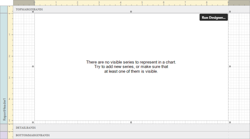
Chart control added to the Report Header band
In the screen capture, all the bands except the Report Header are collapsed.
Step 3: Open Chart Designer
-
Make sure the Chart control is selected and click Run Designer to open Chart Designer.
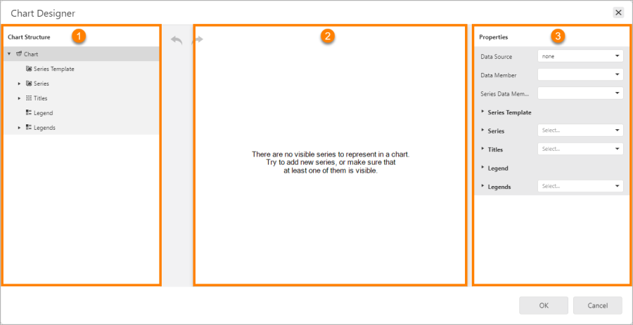
Chart Designer, showing the Chart Structure (
 ), preview area (
 ), and Properties panel (
 )
)The Properties panel shows the properties for the component that is selected in Chart Structure.
Step 4: Add a Bar series to the chart
A series is a set of data points that are plotted in a chart.
-
In Chart Structure, click Series to show the Add icon
 .
. -
Click the Add icon to show the drop-down list of views.
The way that a series is represented in a chart is called the view.
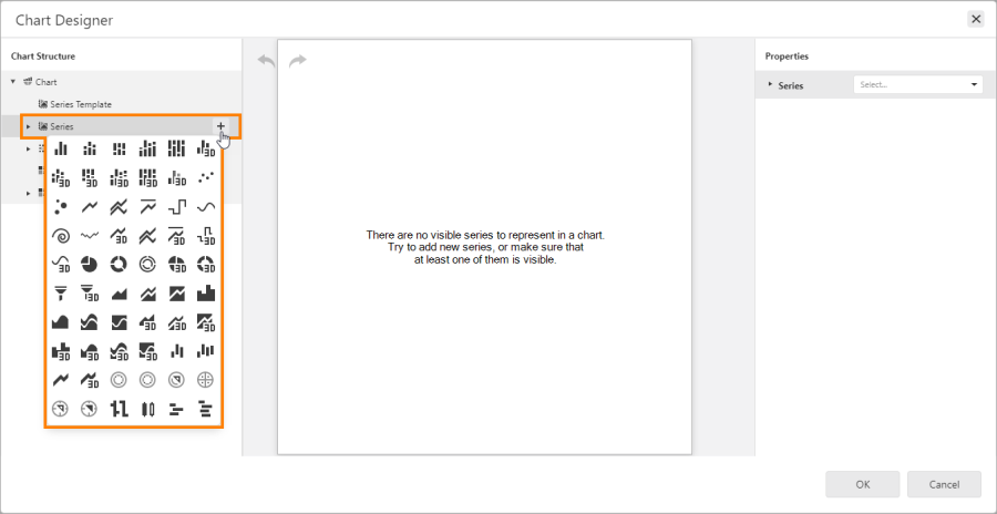
List of views
-
Select Bar
 .
.
Bar view
A series is added to the chart. The new series appears in the Chart Structure, shown below at
. The preview area shows an example of the selected view using sample data provided by Chart Designer (
). The preview also shows the default legend. The Properties panel shows that the series is a bar series (
). 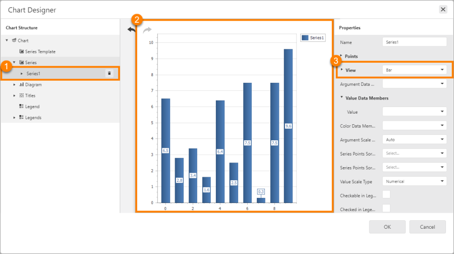
New series (
), preview using sample data (), and the type of view ()
Step 5: Specify the source of the X and Y coordinates
-
Make sure the series is selected in Chart Structure.
-
In the Properties panel, select facname (facility name) from the Argument Data Member drop-down list.
The Argument Data Member setting specifies the field that the X coordinates will come from (the arguments).
-
If necessary, expand Value Data Members.
-
Select sheltcap (shelter capacity) from the Value drop-down list.
The Value setting specifies the field that the Y coordinates will come from (the values).
Step 6: Configure a meaningful label for the legend
To use a more meaningful label than "Series1" in the legend, rename the series. Basing the name on the Value setting provides a meaningful label.
By default, the legend uses the series name. You can override the default by configuring the series' Legend Text Pattern setting. This allows you to use different names for the series and legend.
-
Make sure the series is selected in Chart Structure.
-
In the Properties panel, set Name to Capacity.
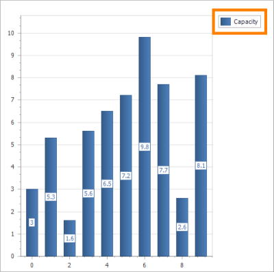
Legend with series name
The chart is ready to preview. To preview a chart using the actual data instead of sample data, preview the report in Report Designer.
Step 7: Preview the report
-
Click OK to close Chart Designer.
-
Click Preview
 to preview the report.
If the chart is blank, see Troubleshooting for help.
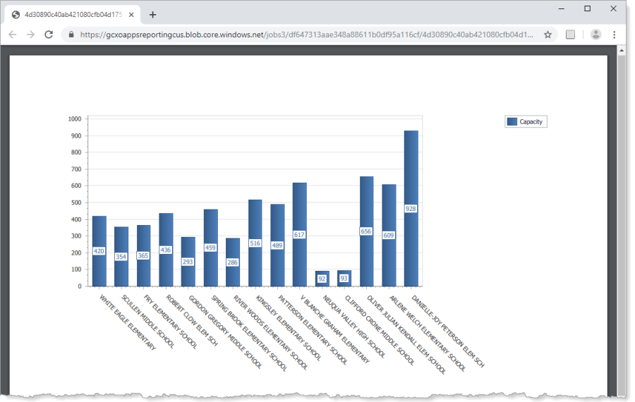
Report preview showing a bar chart that plots the capacity of emergency shelters located in schools
You have successfully created your first chart.
Enhance Your First Chart
This section shows a few ways to improve the chart's appearance and utility. These improvements are configured in Chart Designer.
This section has the following steps:
-
Step 1: Add a title to the chart: Add the chart's title.
-
Step 2: Add a title to the Y-axis: Add a title that describes what the values represent.
-
Step 3: Reposition the legend: Move the legend below the chart.
-
Step 4: Change to a point chart and then to a line chart: Change the view to Point and then to Line. This illustrates how easy it is to change the chart type.
-
Step 5: Add a second series to the chart: Add a second bar series for current occupancy, so you can easily compare capacity and occupancy.
Step 1: Add a title to the chart
-
Open the chart in Chart Designer.
-
In Chart Structure, click Titles to show the Add icon
. -
Click the Add icon to show the list of title positions relative to the diagram.
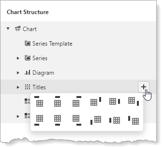
Possible positions of the title (
 ) relative to the diagram (
 )
) -
Select a position for the title, for example, top left
 .
.A title is added to the chart. The new title appears in Chart Structure and in the preview.
-
Make sure the title is selected in Chart Structure.
-
In the Properties panel, set Text to Capacity of Emergency Shelters.
-
Click away from the Text box to update the chart preview.
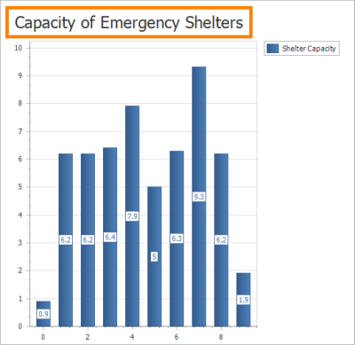
Chart preview showing the chart title at the top left
You can change the title's position at any time using the Dock and Alignment settings.
Step 2: Add a title to the Y-axis
-
In Chart Structure, expand Diagram and select Primary Axis Y.
-
In the Properties panel, scroll down and expand Title.
-
Set Text to Number of Adults.
-
Set Alignment to Center.
-
Set Visibility to True.
-
Expand Font and configure Font Name and Size as desired.
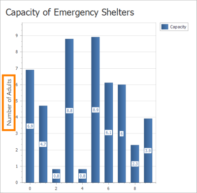
Chart preview showing the title on the Y-axis
Step 3: Reposition the legend
In its default position, the legend takes up some of the available width. Moving the legend to the bottom allows the X-axis to be longer.
-
In Chart Structure, select Legend.
The Chart Structure has two items related to legends—Legend and Legends. Legend is the default legend. Legends are custom legends.
-
Set Vertical Alignment to Bottom Outside.
-
Set Horizontal Alignment to Left.
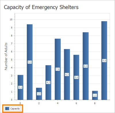
Chart preview showing the legend at the bottom left
Step 4: Change to a point chart and then to a line chart
For a chart with a single series, changing the type of chart is as simple as changing the series' view.
-
In Chart Structure, select the series.
-
In the Properties panel, set View to
 Point.
 -
Click away from the View box to update the preview.
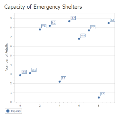
Chart preview of the chart represented as a point chart
-
Set View to
 Line.
Line. -
Click away from the View box.
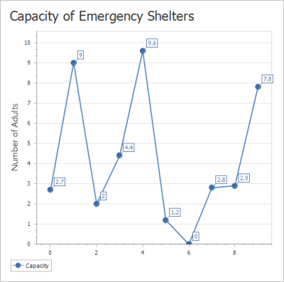
Chart preview of the chart represented as a line chart
-
Reset the view to
Bar in preparation for the next step.
Step 5: Add a second series to the chart
Charts are often used to compare quantities. You can plot more than one data set in a chart to facilitate comparisons.
This step shows how to add a second bar series to the chart. The first series shows shelter capacity. The second series will show the current occupancy.
-
In Chart Structure, click Series to show the Add icon
.
-
Click the Add icon and select
Bar.
-
Set the series name to Current Occupancy.
-
Set Argument Data Member to facname.
-
Set Value Data Members | Value to sheltcurpop.
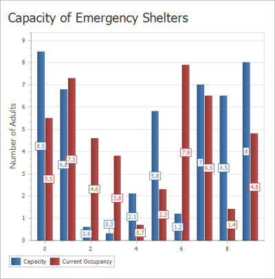
Chart preview of the chart with two bar series
-
Click OK to close Chart Designer.
-
Click Preview
to preview the report.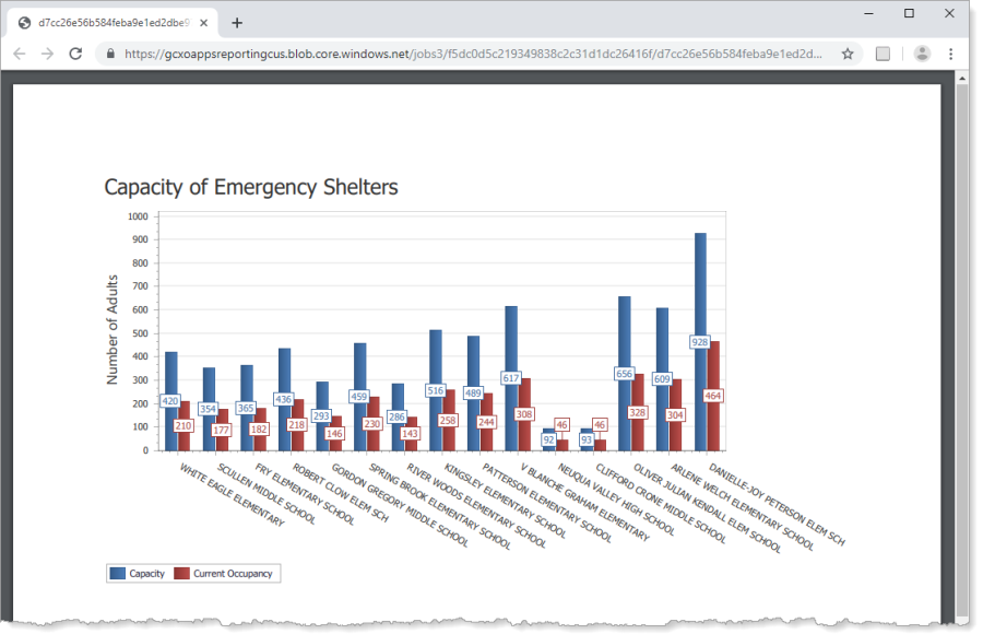
Report preview showing a chart with two bar series, the capacity and occupancy of emergency shelters
Troubleshooting
If the Chart control is completely blank when you preview the report in Report Designer, verify the configuration as follows:
-
Try making the Chart control larger. The default size for the Chart control may be too small for the chart.
-
Make sure you have selected the field to use as the arguments. The field is configured in the series' Argument Data Member setting in Chart Designer.
-
Make sure you have configured a field to use as the values. The field is configured in the series' Value Data Members | Value setting.
-
Make sure the series is not empty. A chart must have at least one series and the series must have at least one data point.