Layout Components
There are a number of layout components that serve to contain other components, allowing you to arrange your layout in a flexible manner. When a component contains other subcomponents, the subcomponents are displayed indented below the component in the Components panel. Container components can be nested, that is, they can contain other container components. Most container components can contain any number of components with the exception of the Scroll component, which can only contain a single component.
Rows 
A Rows component displays the components it contains vertically. In the following example, we see a Rows component titled Search and Results that contains a Search component and a Results List component.

Rows components can be nested and contain other container components. You can modify the alignment and size of subcomponents, and the slot and margin of the Rows component. For more information, see Rows Settings.
Columns 
A Columns component displays the components it contains horizontally. In the following example, we see a Columns component titled Bottom Left Columns that contains a Measure component and a Scale Bar component.

Columns components can be nested and contain other container components. You can modify the alignment and size of subcomponents, and the slot and margin of the Columns component. For more information, see Columns Settings.
Panel 
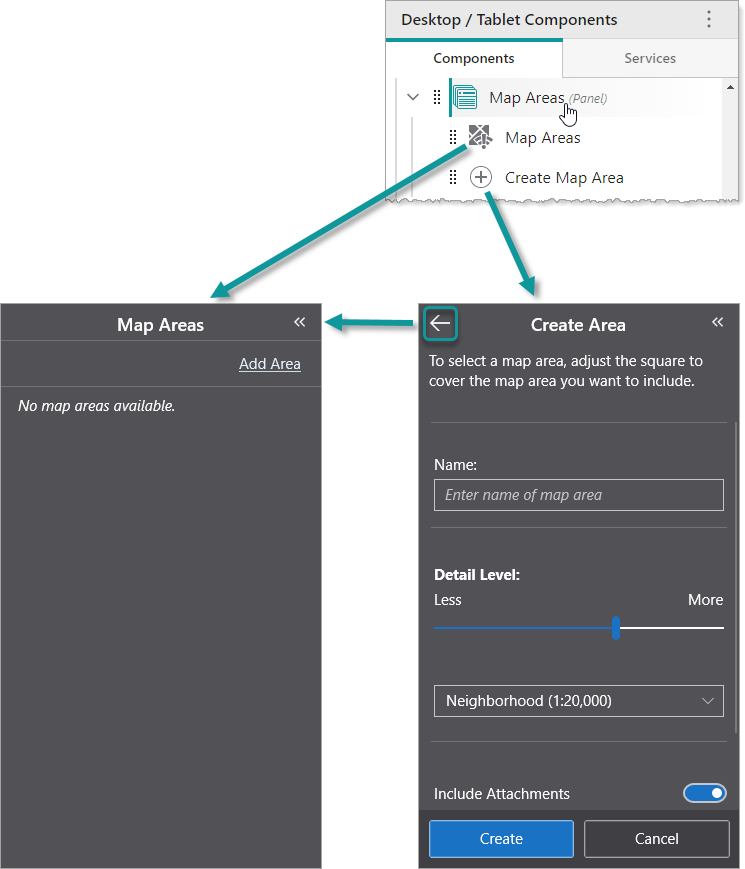
A Panel is a component whose Back button  navigates through any of its subcomponents that were activated towards the first subcomponent. In the following example, we see a Panel component titled Map Areas that contains an Offline Areas component titled Map Areas and a Create Offline Areas component titled Create Map Area.
If the user clicks Add Area in the Offline Areas component titled Map Areas, the panel displays the Create Offline Areas component titled Create Map Area. If the user then clicks the Back button , the panel displays the Offline Areas component titled Map Areas.
You can modify the slot and margin of the Panel component. For more information, see Panel Settings.
We do not recommend nesting Panel components inside other Panel components.
Scroll 
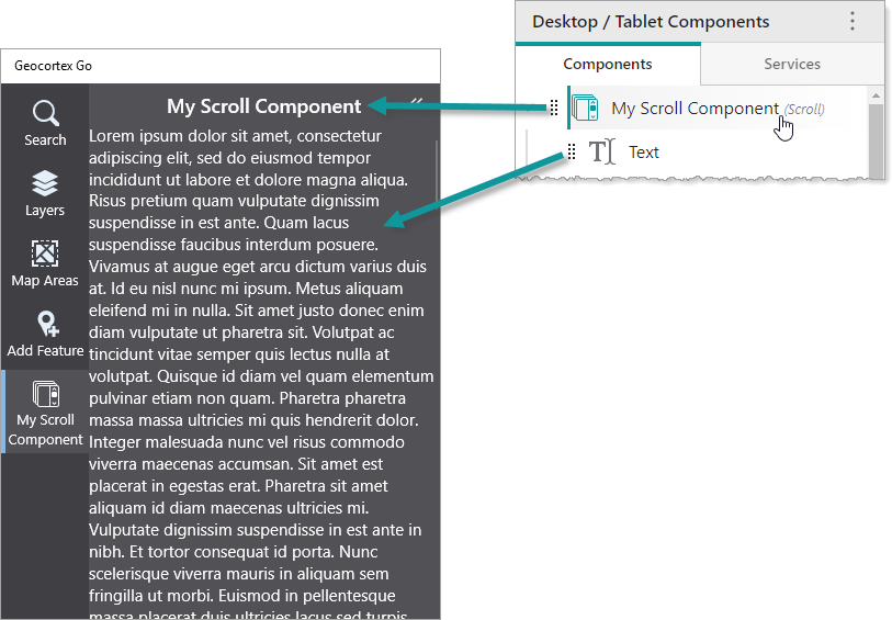
A Scroll component displays its content with a scroll bar if the content is too long. Although the Scroll component can only contain a single component, you can use another container component, such as a Rows component, to add multiple components. In the following example, we see a Scroll component titled My Scroll Component that contains a Text component.
You can modify the slot and margin of the Scroll component. For more information, see Scroll Settings.
We do not recommend nesting Scroll components inside other Scroll components.
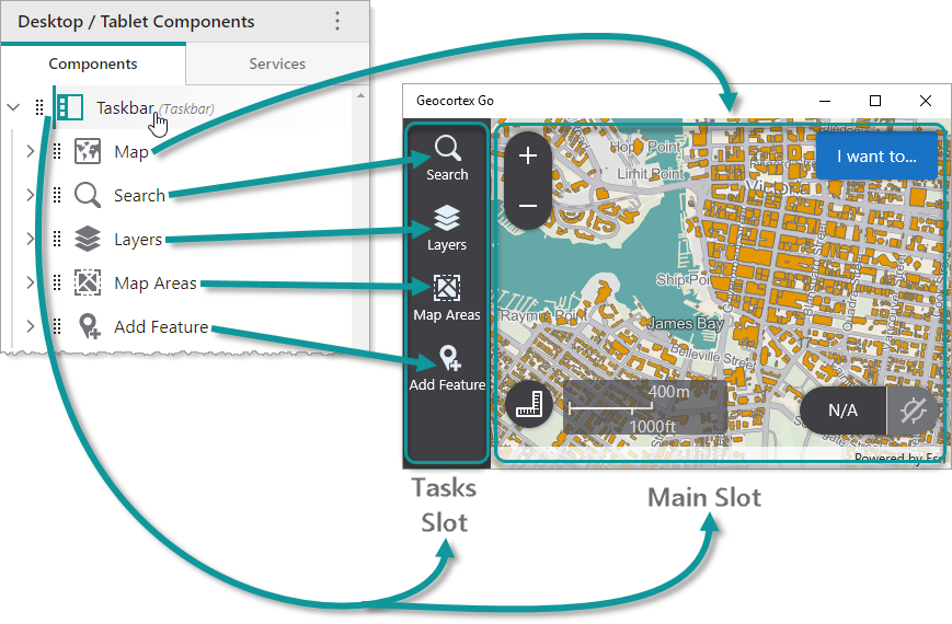
Taskbar 
The Taskbar component consists of two parts, known as slots:
-
Tasks: Subcomponents that use this slot are displayed in the taskbar as menu items that can be opened by clicking them. The titles and icons of subcomponents are displayed in the taskbar.
-
Main: Subcomponents that use this slot are displayed in the main area beyond the taskbar. Usually, a Map component is set to use this slot.
In the following example, we see a Taskbar that contains a Map component that uses the Main slot, and various Panel components that use the Tasks slot.
You can modify the margin and orientation of the Taskbar component. For more information, see Taskbar Settings.
We do not recommend nesting Taskbar components inside other Taskbar components.
Expand 
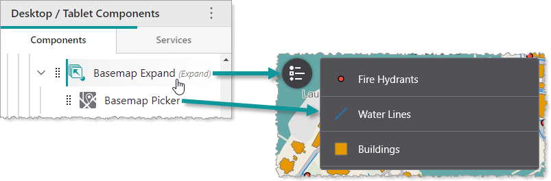
By default, an Expand component hides its subcomponents until it is clicked. Once clicked, it displays its subcomponents vertically. If the Expand component is clicked again, its subcomponents are hidden again. In the following example, we see an Expand component that contains a Legend component.
You can modify the alignment and height of subcomponents, as well as the slot, margin and style of the Expand component. You can also specify whether the Expand component is initially hidden, and whether to display the title or icon. For more information, see Expand Settings.
We do not recommend nesting Expand components inside other Expand components.
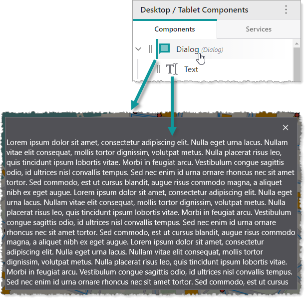
Dialog 
A Dialog is a component that displays its content within a modal dialog window on top of your app. A Dialog may contain any number of subcomponents. In the following example, we see a Dialog component that contains a Text component.
You can modify the margin of the Dialog component. For more information, see Dialog Settings.