Get Started
This tutorial shows you how to get started using the VertiGIS Inline Designer to create a view, configure map options, add a chart and data source, and run the view in the built-in Sandbox test environment.
The tutorial does not show how to configure a web map application to run your Inline views, or work with advanced features and options, such as actions and functions.
Before You Begin
To complete this tutorial, you will need an ArcGIS Identity—either in ArcGIS Online (AGOL) or your enterprise Portal for ArcGIS. If Portal for ArcGIS is used, administrator privileges are required.
Steps to Create and Run a View
The steps to create and run your first view are:
1. Create a View and Configure Map Options
In this step, you will follow the instructions in the Map Options wizard to specify the services map from which the view will draw its data, and set field and display options.
-
Sign in to the VertiGIS Inline Designer.
-
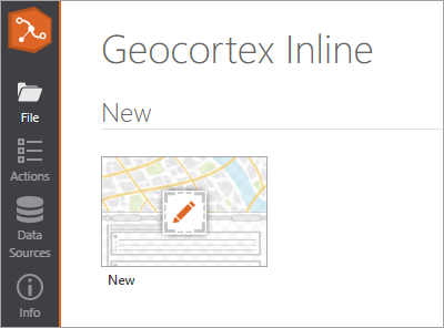
Click New In the Designer.
The Map Options Wizard opens.
-
Click Set new map options, and then click Next.
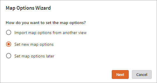
This option configures new map options, but notice that you can also import them or set them later in the Map Options panel.
-
Configure map options as follows:
-
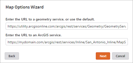
Configure service URLs:
-
Enter the URL of your ArcGIS geometry service, or accept the default value (the ArcGIS Online geometry service).
-
Enter the URL of the ArcGIS map service on which the view will be based.
-
-
Click Next.
-
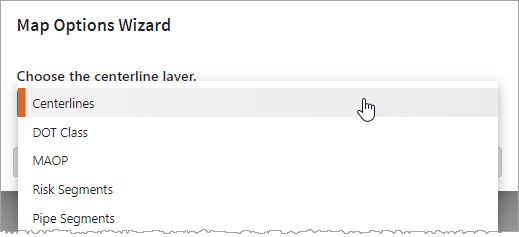
Choose your centerline layer:
-
From the drop-down list, select the centerline layer to use for the view.
The list only includes layers that can be used as a centerline layer—that is, layers of the type polyline. For more information on centerlines, see the ArcGIS documentation.
-
-
Click Next.
-
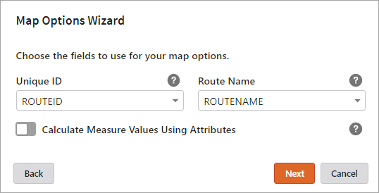
Choose the fields to use for your map options:
-
Unique ID: From the drop-down list, select the centerline field that contains the unique IDs for the centerline features.
-
Route Name: From the drop-down list, select the name of the route name field in your centerline layer.
-
Calculate Measure Values Using Attributes: Enable this option if you want to use the Begin Measure and End Measure centerline fields to calculate the start and end of the segment displayed in the view. If you do not enable this option, Inline uses the geometry of the centerline to calculate these values.
-
If you enable Calculate Measure Values Using Attributes, select the Begin Measure and End Measure fields—the fields that hold the measure values of the start and end of the centerline feature data.
-
If you disable Calculate Measure Values Using Attributes, the Begin Measure Field and End Measure Field values are reset to the default empty strings.
-
-
-
Click Next.
-
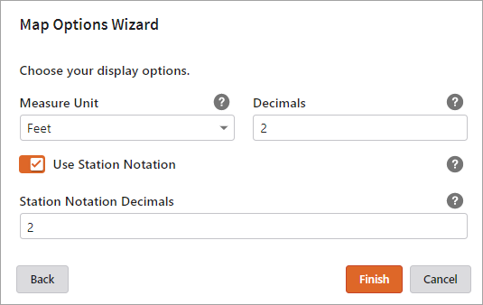
Set your display options:
-
Measure Unit: From the drop-down list, select the unit of measure used for your measure values.
Incorrect configuration of the Measure Unit value may result in unexpected behavior at runtime.
-
Decimals: Enter the number of decimals to be used for the measure value.
-
Use Station Notation: Enable this option if you want the view to display station notation.
-
Station Notation Decimals: When Use Station Notation is enabled, use this field to specify the number of decimals to apply to the station notation. For example, enter 2 to display 12345 as 123+45.
-
-
-
Click Finish.
At any time, select Map Options in the General View Options panel to set, edit, or import map options. See Use the Map Options Panel.
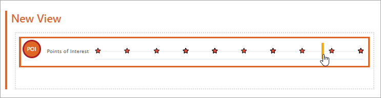
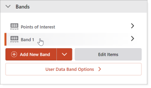
When the view opens, you will see the Points of Interest (POI) band. This is included by default with every new view, and lets your users add points of interest to a published chart at runtime. You do not need to configure this band.
-
-
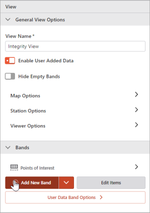
At the right of the screen, in the General View Options panel, enter a name for the view.
2. Add and Configure a Band
In Inline, bands are used as containers in which related charts are grouped. Before you can add a chart to a view, you must first add a band.
-
At the right of the screen, in the General View Options panel, click Add New Band.
-
Click on the band name to open the Band Options panel.
-
Configure General Band Options:
-
Band Name: Enter a name for the band. There are no character limits on the Band Name.
-
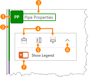
Band Name (Short): Enter a 1 - 3 character abbreviation for the band name. The abbreviation displays inside the band's icon in the upper-left corner of the band (shown below
 ). If you leave this text box empty, Inline creates the abbreviation for you.
 -
Accent Color: Set the color of the band's icon
, and the bar that displays along the left edge  . You can type the hex code or RGB values, or click the color picker to select a color.
 -
Default Chart Height: Select the preferred band height, or set a custom height by entering the number of pixels required.
Typically, the band height you choose will depend on the number of charts you intend to include inside the band, and the type of data these charts will display. You can change this setting later if you need to.
-
Hide Band Name on Start: Hides the band header when the view initially loads in the user's browser
 .
. -
Movable: Allows the user to move the band within the view by clicking Up and Down arrow buttons
 .
. -
Resizable: Allows the user to resize the band by clicking and dragging a slider
 .
. -
Collapsible: Allows the user to collapse / expand the band within the view
 .
. -
Include Legend: Allows you to include a legend for the charts in this band. You can toggle the legend visibility on and off in the band's menu
 .
.
For this tutorial, choose any band height other than X-Small. If you select X-Small for the Default Chart Height, the header options described below are disabled.
-
-
Choose the options you would like to test in the Sandbox later.
-
Set Tooltip Container Configuration options.
These options control the background and border of the tooltips that display on all charts in the band.
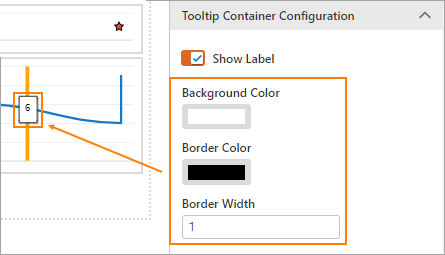
By default tooltips are enabled, but you can turn them off by deselecting the Show Label option.
You must configure the tooltip container options at the band level, but you can configure tooltip text options at the chart level (described below).
-
Configure Y-Axis Options
These options let you configure how the Y axis of the band displays. You can set custom Min and Max Y axis values, the number of Steps—the horizontal bars that display on the Y axis, and the Step Values. You can also turn off the Y axis by selecting the Hide option.
3. Add and Configure a Chart and its Data Source
The following steps show how to add a chart to a band, add a data source on which to base the chart, and configure chart options.
-
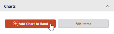
In the Band Options panel, in the Charts section, click Add Chart to Band.
-
Click on the chart name to open the Chart Options panel.
Every chart must be associated with a data source. When you create your first view, the Data Source drop-down list in the General Chart Options section will only contain the data source for the default POI band. When you add a new data source, it is added to this list automatically.
-
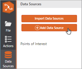
There are two ways to add a data source source:
-
Click Add New Data Source in the Chart Options panel.
- or -
-
Click Data Sources in the left toolbar and then click Add Data Source. Note that this method allows you to import an existing data source or compare previously configured data source settings.
-
-
Enter a name for the data source.
-
Choose either the Map Service or Custom data source type:
-
Map Service: Lets you base your chart on a map service.
-
Custom: Lets you base your chart on a layer.
- The Workflow data source type is an advanced option and beyond the scope of this tutorial. For more information, see Add a Data Source.
- The Point of Interest data source type is required for the configuration of the default POI band only. Do not select this for your own data source.
-
-
Configure your map service or custom data source options as follows:
Map Service data source configuration
-
The Map Service value is automatically set to the URL specified in the Map Options panel.
-
From the Layer drop-down list, select the map layer from which your chart will draw its data.
The layer must have a measure value field—or begin and end measure values if a linear feature layer, and a foreign key field that matches the unique ID field in the centerline layer.
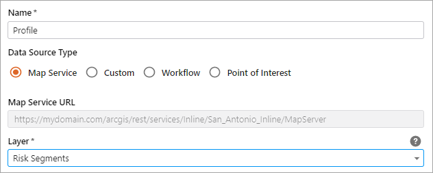
The Designer populates the drop-down lists in the Data Sources panel with information found in the selected layer.
To complete your map service data source configuration, follow the instructions in the Map Service and Custom data source configuration settings table below.
Custom data source configuration
-
In the Layer URL text box, enter the URL of the map layer from which your chart will draw its data.
The map layer must have a measure value field—or begin and end measure values if a linear feature layer, and a foreign key field that matches the unique ID field in the centerline layer.
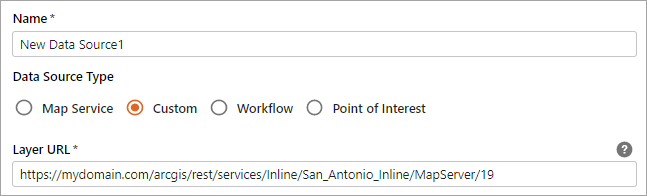
To complete your custom data source configuration, follow the instructions in the Map Service and Custom data source configuration settings table below.
Map Service and Custom data source configuration settings
Setting
Description
Layer URL
The URL of the map layer from which your chart will draw its data. Must have a measure value field, or begin and end measure values if a linear feature layer, and a foreign key field that matches the unique ID field in the centerline layer.
Unique ID Field
The name of the layer's unique ID field. For ArcGIS layers and tables this can be OBJECTID, but another unique ID field may be used if one exists.
Centerline Join Field
The name of the layer's centerline foreign key field.
Data Type
The type of data that will be displayed. Choose Point for point and line charts and Linear for linear charts.
Depending on the type of layer you selected, specify a measure field or begin / end measure fields (shown below).
Measure Field
The field to use for the X axis values
Begin / End Measure
The fields that hold the measure values of the start and end of the linear feature data on which the chart is based.
Use Custom Definition Query
(Optional) Enable this option if you want to filter the data displayed in the view by constructing a custom definition query WHERE clause.
Definition Query:
Enter a WHERE clause that specifies the subset of data to display on the chart.
To reset the query to the default auto-generated query, click the
 Refresh button.
 -
-
Click Apply to save the data source and return to the Chart Options panel.
-
Configure General Chart Options:
-
In the Data Source drop-down list, select the data source you created in step 3.
-
If your data does not have Y values, you can choose one of the following options:
-
Y Value: Assigns a single, static Y value to all data points. Enter the value into the text box.
- or -
-
Y Value Field: Derives Y values from a field. Enter the field name into the text box.
-
-
-
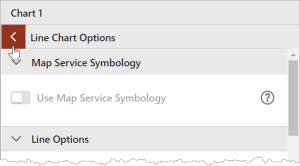
In the Chart Type panel:
-
Choose from the following chart types:
-
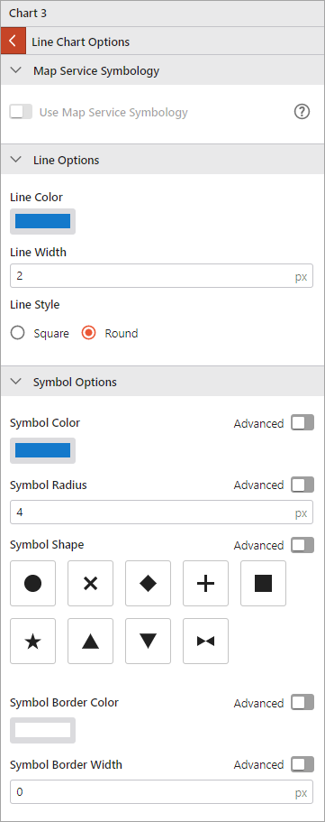
Click Chart Display Options. These options allow you to configure the colors, symbols, lines, and fonts used to display the chart. Note that the options vary depending on the chart type. You can also configure Chart Legend Entries to identify what the chart lines and symbols represent.
-
Close the Chart Display Options and return to the main chart options panel by clicking the arrow at the top of the panel.
-
-
Tooltip Text Configuration:
These options let you configure the tooltip font size and color.
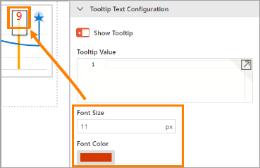
For more information regarding the Text Function property, see Tooltip Text Configuration.
4. Save the View
There are several ways to save your work:
-
Press Ctrl+S
-
In the sidebar, click File, and then click Save or Save As.
The view is saved as an ArcGIS item. You can access it from your Content page in ArcGIS.
5. Run the View in the Sandbox
As you create your view, you can see how it will display to the end user by running it in the Sandbox, Inline Designer's built-in test environment.
-
Click Sandbox in the left toolbar.
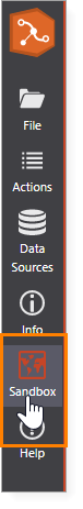
The view opens in the Sandbox environment.
-
At the top of the map panel, select the appropriate web map application.
-
Choose your Route and Start / End points, following the instructions provided.
For instructions on configuring an application to run Inline views, see Configure Web Map Application.