The Web Designer has a user interface (UI) designed to make it fast and easy to create Web apps. One way in which this is done is to always have settings visible in relation to where you are in the hierarchy of settings.
|
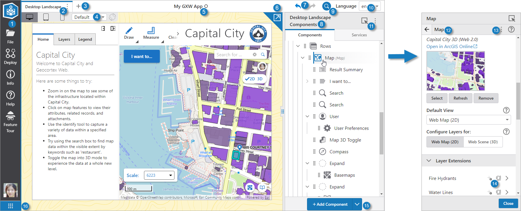
Taskbar: The menu that offers the main categories of tasks. To return to the dashboard that appears when Web Designer initially starts, click |
|
Layout Tab: Displays the title of the layout and includes a menu of layout actions. |
|
Add Layout: Add a new layout to this app. |
|
Device Preview: Allows you to preview the app as it will approximately appear in various types of devices, including desktops, tablets, and phones. See Device Preview. |
|
Application Name: The name given to this app when it was saved. A circle beside the name indicates unsaved changes. |
|
Pop Out Preview: Pops out the app preview in a new window so that you can view it on a separate monitor. |
|
Undo / Redo Buttons: Undoes or redoes changes to the app such as configuration or layout changes. To undo the last change to the app, click . To redo the last undone change to the app, click . |
|
Components Panel: Displays the components of the layout in a tree-like hierarchy. You can also toggle between components and services. Click a component or service to open its configuration panel. |
|
Pinpoint Search: Opens Pinpoint Search, which allows you to search for components, services, settings, layers, fields and operations. |
|
Language Menu: The language in which to configure titles and any other text settings. |
|
Component Selector: Allows you to select a component to edit in the preview. |
|
Panel Subtitle: The subtitle provides context about the settings of the panel. For example, when you view the settings of a layer, the subtitle changes to the name of the layer. |
|
Configuration Options Menu: Displays the menu that allows you to import components from other apps or templates, or to export them, or revert a component's configuration to the default settings if applicable. |
|
One-click Settings and Expand Arrow: Icons that you can click to instantly change the settings of this item, for example, Disable Identify and Disable Search for a particular layer. You can click the arrow to expand another panel of settings to apply to that particular item. |
|
Add/Remove Component Button: By default, opens the Toolbox panel, which contains components you can add to your layout. If you drag an existing component into it, the button becomes the Remove Component button and the dragged component is removed. |
|
Switch to Another VertiGIS Studio Product: Clicking this button will allow you to quickly switch to another VertiGIS Studio product. If the product is already open in a different browser tab, selecting the product will take you to that tab instead of opening a new tab. Only available in the SaaS version. |

 .
.


